ELEMENTS OF DESIGN
Refers to the basic structures that make up every work of art. The quality of a work of art is dependent upon whether or not its design elements convey the feeling or thought that the artist intended to portray. There are eight essential elements of design to know. They are as follows...
Refers to the basic structures that make up every work of art. The quality of a work of art is dependent upon whether or not its design elements convey the feeling or thought that the artist intended to portray. There are eight essential elements of design to know. They are as follows...
LINE
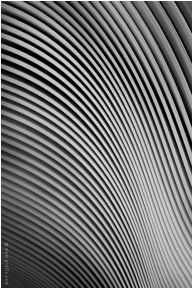
A connection of two points. Lines can be straight (rectilinear), curved (curvilinear), or wavering (serpentine or zigzag). Lines that define the edges of an object are called "contour lines." Contours include the exterior edges of an object as well as sharp changes in planes, color, value, and texture. Lines that express a particular emotion or feeling of the subject are called "gestures." These lines show emotion through their use of style and texture. Lastly, many "lines" in works of art do not exist at all but, rather, are "implied." That is, the viewer's eye makes a line as it travels between two or more objects. Lines are the building blocks of shapes.
A connection of two points. Lines can be straight (rectilinear), curved (curvilinear), or wavering (serpentine or zigzag). Lines that define the edges of an object are called "contour lines." Contours include the exterior edges of an object as well as sharp changes in planes, color, value, and texture. Lines that express a particular emotion or feeling of the subject are called "gestures." These lines show emotion through their use of style and texture. Lastly, many "lines" in works of art do not exist at all but, rather, are "implied." That is, the viewer's eye makes a line as it travels between two or more objects. Lines are the building blocks of shapes.

|
|
SHAPE
An enclosed series of one or more lines. Basic examples of shapes include circles, ellipses, triangles, rectangles, and all other polygons. There are two major types of shapes, geometric shapes and organic shapes. Geometric shapes reside within a predetermined list of shapes (e.g., square, ellipse, triangle, hexagon, etc). Organic shapes are any shape that has an irregular edge to it (e.g., a potato, mountain, skull, etc). Each real life objects are organic shapes that can be reduced to basic geometric shapes. Although every work of art consists of shapes, not all shapes are immediately apparent. Sometimes shapes are blurred, implied, or reside in the oft-forgotten negative space on an image.
An enclosed series of one or more lines. Basic examples of shapes include circles, ellipses, triangles, rectangles, and all other polygons. There are two major types of shapes, geometric shapes and organic shapes. Geometric shapes reside within a predetermined list of shapes (e.g., square, ellipse, triangle, hexagon, etc). Organic shapes are any shape that has an irregular edge to it (e.g., a potato, mountain, skull, etc). Each real life objects are organic shapes that can be reduced to basic geometric shapes. Although every work of art consists of shapes, not all shapes are immediately apparent. Sometimes shapes are blurred, implied, or reside in the oft-forgotten negative space on an image.

FORM
A series of connected shapes that appears 3D. Some basic examples of forms include spheres, cones, cylinders, cubes, and pyramids. Like lines and shapes, forms can also be implied. Forms give a work of art "depth." That is, series of forms are what make a viewer feel like they can enter into a painting and wander around in it. Forms are created either by creating a complete systems of lines and/or by including shadows and highlights.
A series of connected shapes that appears 3D. Some basic examples of forms include spheres, cones, cylinders, cubes, and pyramids. Like lines and shapes, forms can also be implied. Forms give a work of art "depth." That is, series of forms are what make a viewer feel like they can enter into a painting and wander around in it. Forms are created either by creating a complete systems of lines and/or by including shadows and highlights.
|

|
SIZE
Size refers to how big or small something is in relationship to the other forms on a page. Size is important to emphasize an object's relationship with something else on the page and/or its perspective. To emphasize an object's importance the artist might choose to make the object bigger or smaller depending on the circumstances. In order to make an object appear to be farther in the background, the artist will make the object smaller. In the opposite way, to make the image appear closer to the viewer, it will have a larger size.
Size refers to how big or small something is in relationship to the other forms on a page. Size is important to emphasize an object's relationship with something else on the page and/or its perspective. To emphasize an object's importance the artist might choose to make the object bigger or smaller depending on the circumstances. In order to make an object appear to be farther in the background, the artist will make the object smaller. In the opposite way, to make the image appear closer to the viewer, it will have a larger size.

|

|
SPACE
Space is the area on a page as it is defined by the objects on a page. The proper placement of objects depends on intentional consideration of the space that object fills as well as the implied space around the object(s). That is to say technically, negative space (or the space in between objects) is as important as positive space (objects).
Space is the area on a page as it is defined by the objects on a page. The proper placement of objects depends on intentional consideration of the space that object fills as well as the implied space around the object(s). That is to say technically, negative space (or the space in between objects) is as important as positive space (objects).

|
|
TEXTURE
The tactile appearance of an object. Texture refers to what a person might imagine how a represented object feels. Some textures include smooth, soft, rough, hard, fuzzy, wet, slick, broken, tough. The use of the element of texture works to affect the mood and meaning of a piece. Smooth cut lines and shapes will make the piece appear smooth and calculated. Torn lines and shapes will make the piece appear organic and chaotic. Mixing together textures of contrasting quality can create a subtle intrigue and dynamism that would not otherwise be in the work of art.
The tactile appearance of an object. Texture refers to what a person might imagine how a represented object feels. Some textures include smooth, soft, rough, hard, fuzzy, wet, slick, broken, tough. The use of the element of texture works to affect the mood and meaning of a piece. Smooth cut lines and shapes will make the piece appear smooth and calculated. Torn lines and shapes will make the piece appear organic and chaotic. Mixing together textures of contrasting quality can create a subtle intrigue and dynamism that would not otherwise be in the work of art.

|

|
VALUE
Referring to the scale of lights and darks in a work of art. The brightest value is white and the darkest value is black. High contrasting value includes the use of almost purely white brights and black darks. Low contrasting values are composed of a series of "grays." Colors also contain a value within them. The brightly valued colors are yellows and oranges. Dark values include purples and blues. Pure red and green share the same neutral gray value.
Referring to the scale of lights and darks in a work of art. The brightest value is white and the darkest value is black. High contrasting value includes the use of almost purely white brights and black darks. Low contrasting values are composed of a series of "grays." Colors also contain a value within them. The brightly valued colors are yellows and oranges. Dark values include purples and blues. Pure red and green share the same neutral gray value.

|

|
COLOR
A conglomeration of hue (pigment), value (brightness), and intensity (saturation). Color is often the most immediately noticeable and complex of all the design elements.
The three primary colors are blue, yellow, and red. When mixed together one to one, they create three secondary colors, orange, green, and purple. Each primary color has a "complimentary" secondary color. The compliment of that primary color is the mixture of the other two contrasting primary colors. Any primary and secondary color can be mixed together to create a "tertiary color."
When these colors are not grayed through value or saturation they are called "pure hues." Pure hues are used minimally in art. More often, artists use colors with manipulated values and saturation. By manipulating a hue's value and saturation the artist can create illusions of form, depth, and texture. The result are what artists call "tones." This process is precisely the task of a fine art painter. For example, a painted might make a gray concrete street by mixing together yellow, purple, and white. In some spots he might use more yellow to get a warmer, brighter tone. In other areas he would use more purple and less white to get a dark, rich gray in the shaded areas.

|

|
PRINCIPLES OF DESIGN
Guiding concepts that artists utilize when creating art so as to convey a particular message and/or sentiment between the viewer and the work of art. Whereas elements of design are like the materials and tools for a piece of art, principles are like its blueprint and guidelines. The essential principles of design are as follows...
Guiding concepts that artists utilize when creating art so as to convey a particular message and/or sentiment between the viewer and the work of art. Whereas elements of design are like the materials and tools for a piece of art, principles are like its blueprint and guidelines. The essential principles of design are as follows...
BALANCE
Every element and object placed on a canvas has a particular visual weight to it and thus can either make a piece seem more stable or unstable-balanced or unbalanced. Stable, balanced pieces are calming and often easy to read. Unstable, imbalanced pieces can appear odd, exciting, and dynamic. They are a bit more confusing than a balanced piece, but also more exciting.
The easiest way to make something balanced is to make a symmetrical work of art. That is, to make the left side mirror the right side. Such a piece feels very stable and secure to the viewer. More negatively, people can also think of a perfectly symmetrical work of art as being somewhat boring. A more nuanced way to make something balanced is to do so using asymmetry. An overall balanced composition makes the piece attractive and comfortable to viewers while its asymmetry adds intrigue and movement to the piece.
Balance can be found by the use of all the elements of design. For example, strong colors are balanced out with other strong colors from the opposite side of the color wheel. A large square can be balanced out by an equally large circle. Or, any large shape can be balanced out by a conglomerate of smaller shapes. A diagonal line going down and to the right is balanced by another diagonal line going down and to the left. These are just three of an infinite number of examples.
Balanced and symmetrical.
|
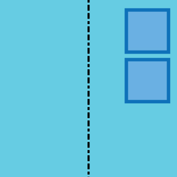
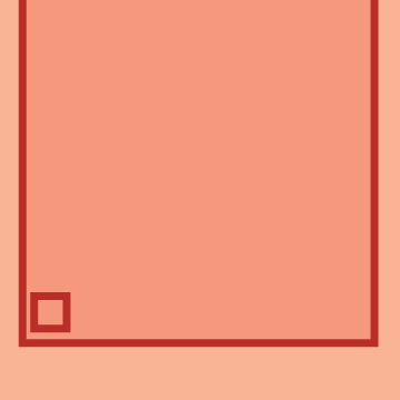
asymmetrical imbalance. The right side weighs more than the left side, drawing the viewer's eyes toward the upper right corner.
|
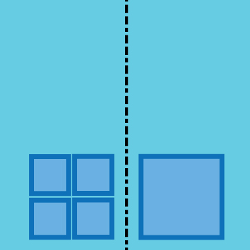
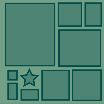
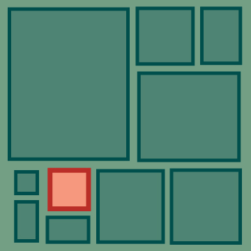
Asymmetrical balance. Even though the piece is not symmetrical, it is balanced because the visual weight of the combined four squares on the left equals the one square on the right.
|
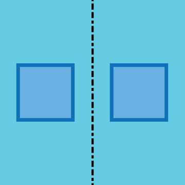
PROPORTION/SCALE
Proportion/Scale gives the illusion of depth to a work of art. An artist can make an object appear closer or father by adjusting its size on the page and/or its size relative to other objects. Larger objects will appear closer to the viewer than smaller objects. In addition to depth, larger objects can at times appear more "important" because they draw more attention to themselves than smaller objects. Smaller objects, when given a strong contrast in value or color can overcome their lack of size.
Proportion/Scale gives the illusion of depth to a work of art. An artist can make an object appear closer or father by adjusting its size on the page and/or its size relative to other objects. Larger objects will appear closer to the viewer than smaller objects. In addition to depth, larger objects can at times appear more "important" because they draw more attention to themselves than smaller objects. Smaller objects, when given a strong contrast in value or color can overcome their lack of size.
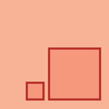
Two squares identical in all things but size. Because the square on the right is more prominent, it draws the greater attention from the viewer. The smaller square seems to be dependent on the larger one.
|
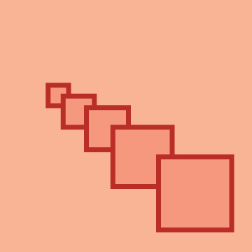
Properly placed, squares of decreasing size can appear like they are moving back into deeper space. The proper use of proportion can give the illusion of 3D depth on a 2D panel.
|
Making s shape's size larger than the panel can increase its immensity. That said, because the larger square is not totally visible, the stronger shape has become the smaller square because it is completely in the panel.
|
CONTRAST
Contrast is variation of any design element (color, value, line, shape, texture, etc). Works of art with strong contrast convey action, tension, excitement and/or even discord.Strong contrast also makes transitions very clear and is often used to convey information (e.g., strong black print on white paper).
Contrast is variation of any design element (color, value, line, shape, texture, etc). Works of art with strong contrast convey action, tension, excitement and/or even discord.Strong contrast also makes transitions very clear and is often used to convey information (e.g., strong black print on white paper).
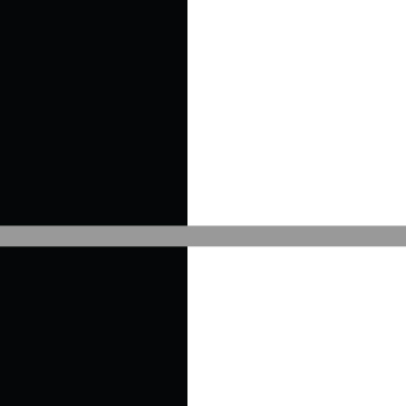
Contrast, as with all principles, is relative to the elements on the page. Over the black section the gray stripe appears light. Over the white section it appears dark.
|
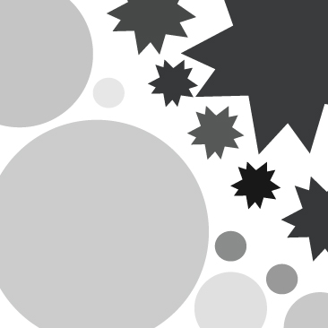
Contrasting shapes and values can strongly affect a viewer's emotions. The left corner is soft and playful whereas the right corner is sharp and dangerous. This sentiment is made by contrasting value and shape.
|

Contrast is not always as explicit as the first two examples. In fact, most of the contrast in a work of art is subtle and, unless it is explicitly examined, never even noticed. Notice above how the square, very softly, moves from white to black. Where does it exactly change? Even though the change is obvious, the actual moment of change is impossible to notice.
|
EMPHASIS
This principle is used to direct the viewer's attention to particular objects, areas, or movement within the artwork. Emphasis creates what is known as a "focal point" in the artwork. Emphasis is created by using contrasting and by placing an object in a particular area of the frame that lends itself to being a natural focal point. These areas are found by dividing the work of art into thirds vertically and horizontally (for an example of this, just check out the camera on Instagram and look at the grid on the screen. It divides the picture in thirds! The intersections can serve as focal points).
This principle is used to direct the viewer's attention to particular objects, areas, or movement within the artwork. Emphasis creates what is known as a "focal point" in the artwork. Emphasis is created by using contrasting and by placing an object in a particular area of the frame that lends itself to being a natural focal point. These areas are found by dividing the work of art into thirds vertically and horizontally (for an example of this, just check out the camera on Instagram and look at the grid on the screen. It divides the picture in thirds! The intersections can serve as focal points).
The focal point is the green star because it is the only non-rectangular shape. Emphasis is on what's different.
|
The focal point is the red square because it is the only non-green thing on the page.
|
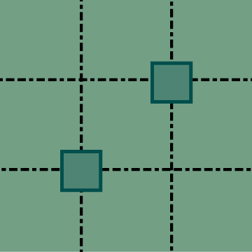
Here the focal points are the two rectangles. Each panel has four natural locations that serve as focal points. These are the intersection of the lines that divide a panel in thirds.
|
PATTERN
The repetition of design elements following a particular direction and sequence. A pattern can include shapes (e.g., polkadots), lines (e.g., plaid), color (e.g., double rainbows). Patterns, always follow some kind of sequence, some are extremely simple (e.g., stripes), and others are very complex. When patterns are compressed or elongated, or when they change their proportion, they create movement in a piece.
The repetition of design elements following a particular direction and sequence. A pattern can include shapes (e.g., polkadots), lines (e.g., plaid), color (e.g., double rainbows). Patterns, always follow some kind of sequence, some are extremely simple (e.g., stripes), and others are very complex. When patterns are compressed or elongated, or when they change their proportion, they create movement in a piece.
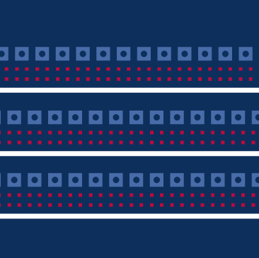
This simple horizontal pattern moves the viewer's eyes from left to right and from top to bottom. It repeats three elements--blue, red, and white.
|
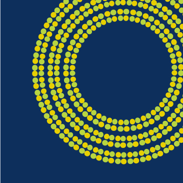
Patterns can imply shapes. Rather than simply drawing a circle, use a pattern. Patterns imply shapes and forms in creative ways.
|

The repetition of this very simple pattern moves the viewer from the bottom to the top of the page. This is done not by any adjustment to the pattern, but to its opacity. Making the pattern more translucent near the top adds the the action of the pattern.
|
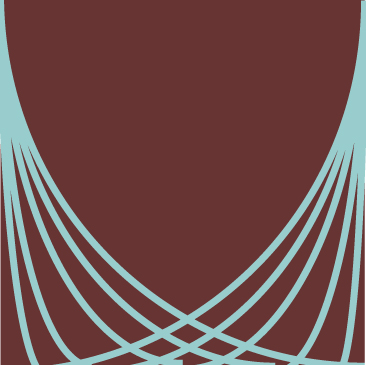
RHYTHM/MOVEMENT
This is a subset within pattern. When patterns are compressed or elongated, or when they change their proportion, they create movement in a piece. By using rhythm in a design a piece ceases to be static. What was at one point lifeless all of the sudden appears to move. The use of rhtyhm is crucial to make a piece "come to life."
This is a subset within pattern. When patterns are compressed or elongated, or when they change their proportion, they create movement in a piece. By using rhythm in a design a piece ceases to be static. What was at one point lifeless all of the sudden appears to move. The use of rhtyhm is crucial to make a piece "come to life."
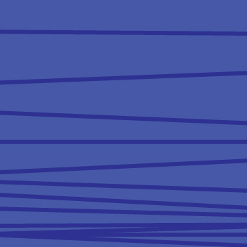
This simple pattern of horizontal stripes, when condensed toward the bottom gives the appearance that these stripes are falling off the wall and collecting at the base of the panel.
|

Simply by moving a wavy line to the right or left so that the tangents touch give the appearance of a 3D wave. Even more intrigue is created by moving the wave on a diagonal axis rather than a horizontal one.
|
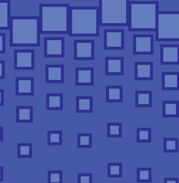
This pattern, when decreased in size toward the bottom, creates what looks to be descending squares...it's as if the design is raining. To add additional dynamism into the piece, the top squares are all on similar but not identical horizontal axis.
|
HARMONY
Harmony is the technical term for when things go well together. Harmony is achieved when the elements of a work of art relate to one another in some way (e.g., same color, line style, shapes, texture, direction, and movement). Patterns and movement, when used throughout a piece, can also create harmony through a piece. Contrasting elements can also be in harmony as long as they are used methodically and an object's honest contrast is used in some kind of repetition--this is most important when working with colors. Harmony is also used to talk about the overall composition of a piece. Like a song wherein all the instruments are playing together on key, if all of its elements are seamlessly unified it is a harmonious work of art.
Harmony is the technical term for when things go well together. Harmony is achieved when the elements of a work of art relate to one another in some way (e.g., same color, line style, shapes, texture, direction, and movement). Patterns and movement, when used throughout a piece, can also create harmony through a piece. Contrasting elements can also be in harmony as long as they are used methodically and an object's honest contrast is used in some kind of repetition--this is most important when working with colors. Harmony is also used to talk about the overall composition of a piece. Like a song wherein all the instruments are playing together on key, if all of its elements are seamlessly unified it is a harmonious work of art.
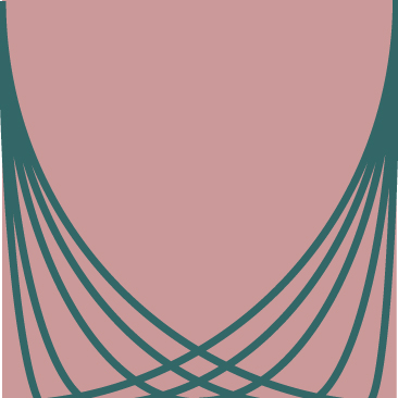
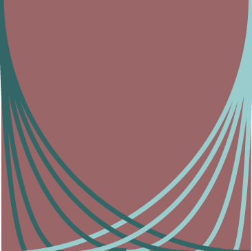
These three panels harmonize together through the use of color, line, and value.
|
|
|
